Advanced CSS and Bindings
The Advanced section in the Properties Panel gives you direct access to a component's CSS and lets you link CSS values to live data from your module.
Interact Fundamentals
10 min read
Before You Begin
This is an optional feature for users who are comfortable writing CSS. Most designs can be achieved entirely through the built-in controls. Familiarity with Variables is helpful when using Bindings, since bindings connect CSS values to number variables and other live values in your module.
Overview
Every component has an Advanced section at the bottom of its Properties Panel. It is collapsed by default and stays out of the way until you need it.
Two things live here. The CSS field accepts any valid CSS you want to apply to the component: override built-in styles, add effects the UI does not expose, or write complex rules using pseudo-classes and pseudo-elements. The Bindings subsection lets you create named CSS variables that draw their values from number variables or other component properties in your module. Once a binding exists, you can reference it anywhere in your CSS using var(--name).
The result is CSS that responds to what the learner does. A component's size, color, rotation, or shape can all be driven by variables that update in real time, with no code needed outside the CSS textarea.
Understanding Advanced CSS and Bindings
The Advanced Section
The Advanced section appears at the bottom of the Properties Panel for every component. It collapses automatically when empty and expands when you have content to review. It contains two subsections (Bindings and CSS) that are designed to work together.
Nothing in Interact requires you to use this section. It exists for cases where the built-in controls are not enough.
CSS Bindings
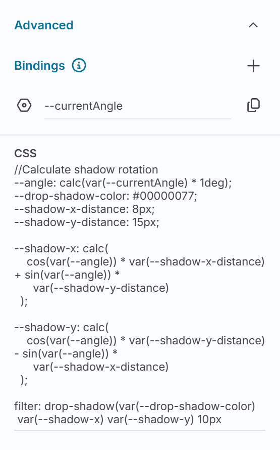
CSS Bindings create named CSS custom properties whose values come from Interact. You choose a name and choose what value to bind (a number variable, a component property), and the binding makes that value available in your CSS as var(--name).
Creating a binding:
Select a component and expand the Advanced section in the Properties Panel.
Click the + button in the Bindings subsection.
In the dialog, select what to bind to. Only number values are available: number variables, or number properties from other components in scope.
Enter a name. This becomes the CSS variable name you will reference as
var(--name).Optionally enter a placeholder value as a fallback when the live value is unavailable.
Once a binding exists, click its copy button to copy var(--name) to your clipboard, ready to paste into the CSS field.
Note: CSS Bindings only support number values. String and boolean variables cannot be bound directly. To use a non-number value in CSS, consider driving it through a number variable instead.
The CSS Field
The CSS field accepts any valid CSS for the component. Write it exactly as you would in a stylesheet:
To reference a binding, use the standard CSS custom property syntax:
You can use any CSS feature the browser supports: pseudo-classes (:hover, :focus), pseudo-elements (::before, ::after), calc(), min(), max(), clamp(), transitions, filters, and more. The CSS applies directly to the component's root element.
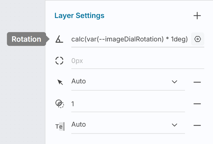
Expressions on Property Inputs
Many of the numeric inputs in the Properties Panel also support CSS expressions without going to the CSS field. Hover over a supported input (Rotation, Width, Height, Corner Radius, padding, position, or gap fields) and a settings icon appears. Click it to open a popover where you can:
Type any valid CSS value for that property, including
calc()andvar()referencesClick an existing binding to insert its reference automatically (for rotation, this inserts
calc(var(--name) * 1deg)with the unit applied for you)Add a new binding without leaving the popover
This is the quickest way to apply a single dynamic value to one specific property.
Examples
The following examples show a range of what is possible, from pure CSS visual effects to fully dynamic, interaction-driven behaviour.
Custom Shape with Clip Path
The CSS clip-path property masks a component to a custom shape. Apply it to a Container to create geometric shapes that the built-in border radius control cannot produce.
A diamond:
A hexagon:
A speech bubble (pointing downward), using a precise path:
Note:
clip-pathcrops everything outside the shape, including shadows and borders. If a component has a visible border, applyclip-pathto a wrapping Container instead so the border is not cut.
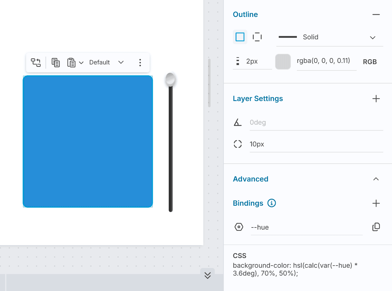
Slider-Driven Color
A Slider component's position can drive the background color of another component in real time, using a number variable as the bridge.
Configure a Slider component, give it the name
Color Chip Slider, set it to use Steps with a minimum to 0 and maximum to 100.Add a container to the canvas and give it the name "Color Chip". This is the canvas element whose color we will change. Select this container and expand Advanced and click + in Bindings. Add a binding as follows:
Bind to:
Color Chip Slider - Step PositionName:
--hue
In the CSS field, write:
The multiplier 3.6 maps 0–100 to 0–360, cycling through the full color wheel. As the learner drags the slider, the color updates in real time without any additional response logic.
To adjust saturation or lightness dynamically, create additional bindings and compose them into the hsl() function in the same way.
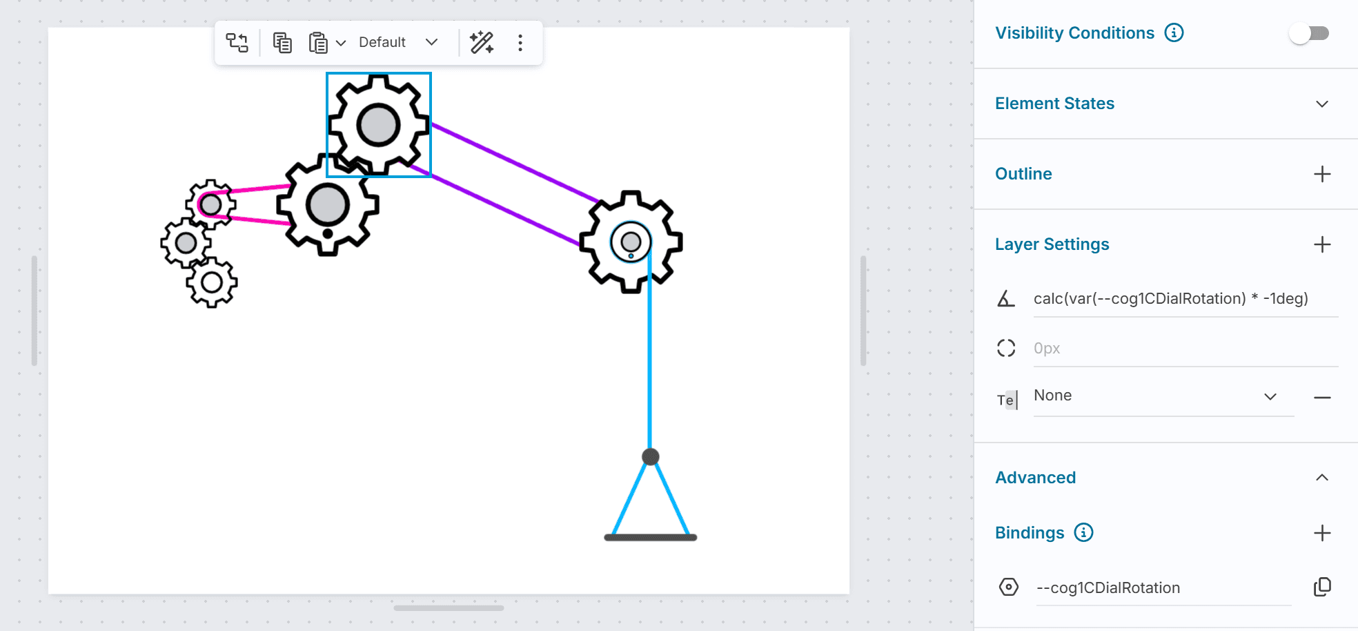
Counter-Rotating Cogs
Two gear images can be made to rotate in opposite directions, simulating interlocking cogs, by driving both from the same number variable and negating the value for one.
Create a Number Variable (for example,
cog-rotation) to hold the angle.Configure a Slider or trigger to update
cog-rotationas the learner interacts. This becomes the input that drives both gears.Select the Container holding the first gear image. Expand Advanced and create a Binding:
Bind to:
cog-rotationName:
cog-a
Hover over the Rotation input and click the settings icon. In the popover, click the
cog-abinding. The expressioncalc(var(--cog-a) * 1deg)is inserted automatically.Select the Container holding the second gear image. Expand Advanced and create a Binding:
Bind to:
cog-rotationName:
cog-b
Hover over the Rotation input of the second Container and click the settings icon. Type the following directly into the input:
The negative multiplier makes this gear rotate in the opposite direction to the first.
As the cog-rotation variable changes, both gears update simultaneously: one clockwise, the other counter-clockwise.
For gears of different sizes, adjust the multiplier to match the gear ratio. A gear half the diameter of the first rotates twice as fast in the opposite direction:
Progress Bar Fill
A Container's width can be driven by a number variable to create an animated progress bar, useful on results screens or during scored activities.
Create a Number Variable (for example,
score) with a range of 0 to 100.Create an outer Container styled as the track (fixed width, background color, rounded corners).
Inside it, create an inner Container styled as the fill (a contrasting background color, full height). In its Advanced section, create a Binding:
Bind to:
scoreName:
progress
In the inner Container's CSS field:
As the score variable updates (through trigger actions that fire at activity completion), the fill width adjusts. The transition rule animates the change smoothly.
Gradient Text
CSS can render text with a gradient fill. Apply this to the Container wrapping a Text component to show the gradient through the text.
The Container's gradient is clipped to the shape of the text, and the transparent color lets it show through. Adjust the angle and color stops to match the design.
[!TIP] Gradient not showing
If the gradient does not appear, check that the Container is sized tightly around the text. A Container much larger than its text content may cause the gradient to be positioned outside the visible area.
Hover Effect with CSS Transition
A Container can respond to the learner hovering over it using the :hover pseudo-class, without any trigger logic.
This lifts the component and adds a shadow when hovered, giving it the feel of an interactive card. Because it is pure CSS, the effect works at runtime without any response configuration.
Decorative Quote Block with ::before and ::after
The ::before and ::after pseudo-elements insert generated content before and after a component's content. A common e-learning use is adding large decorative quotation marks around a testimonial or expert quote, without needing separate Text components for the marks.
Apply this to the Container holding the quote text:
\201C and \201D are the Unicode values for left and right double quotation marks. The position: relative on the parent keeps the pseudo-elements anchored to the Container rather than the page.
::before and ::after are also useful for:
Adding a colored accent bar to the left of a Container:
&::before { content: ''; position: absolute; left: 0; top: 0; width: 4px; height: 100%; background: #6366f1; }Adding a badge label in the corner of an image or card
Drawing a decorative divider line between sections
Variable Font Weight with clamp()
Variable fonts support font-weight as a continuous range rather than fixed steps. clamp() is useful here to drive the weight dynamically from a binding while guaranteeing it stays within valid bounds.
Create a binding named weight-input from a number variable (driven by a slider set to 0–100), then apply this to the Container holding your text:
This maps the 0–100 slider range to a font weight of 300–900. The clamp() ensures the result never falls below 300 or exceeds 900, even if the variable goes slightly out of range. At 0 the text is light; at 100 it is heavy.
font-weight is an inherited CSS property, so applying it to a Container propagates it to all Text components inside.
You can use the same pattern with font-size and a viewport-relative value, or with opacity to fade a component based on a score. clamp() is a reliable safety net any time you are mapping one numeric range onto another.
Common Tasks
Applying Custom CSS to a Component
Select the component on the canvas.
In the Properties Panel, scroll to the Advanced section and expand it.
Click the CSS field and write your CSS.
Click elsewhere on the canvas or press Tab to apply.
Creating a CSS Binding
Select the component and expand the Advanced section.
In the Bindings subsection, click +.
Choose the value to bind to: a number variable or a component property from the same scope.
Enter a name. The binding will be accessible in CSS as
var(--name).Optionally enter a placeholder fallback value.
Click Save.
To copy the CSS variable reference to your clipboard, click the copy button next to the binding name.
Using a Binding in a Specific Property Input
Hover over a supported input (Rotation, Width, Height, Corner Radius, padding, position, or gap).
Click the settings icon that appears.
In the popover, click an existing binding to insert its expression automatically, or type a CSS value directly.
Click outside the popover to apply.
Related Topics
[!DocPage] Creating the number variables that CSS Bindings can reference
[!DocPage] The primary component where Advanced CSS is most commonly applied
[!DocPage] Setting up the trigger actions that update variables, which then drive CSS expressions
[!DocPage] For JavaScript-driven behaviour beyond what CSS expressions can achieve