Activity Designer
The Activity Designer is the WYSIWYG canvas where you build the visual content and interactions inside an Activity.
Key Areas
11 min read
Activity Designer
The Activity Designer is the WYSIWYG canvas where you build the visual content and interactions inside an Activity.
Overview
When you open an Activity, the Activity Designer gives you a live canvas that looks exactly as it will to learners. You place components directly onto it, see the result immediately, and adjust until the design is right. There is no preview step or rendering delay between editing and seeing the output.
The canvas sits at the centre of the Designer. Panels on the left give you access to your component library and the structure of what you have built. The Properties Panel on the right updates to show the settings for whatever you have selected. Zoom and device controls in the view bar let you design for any screen size and check your work at any scale.
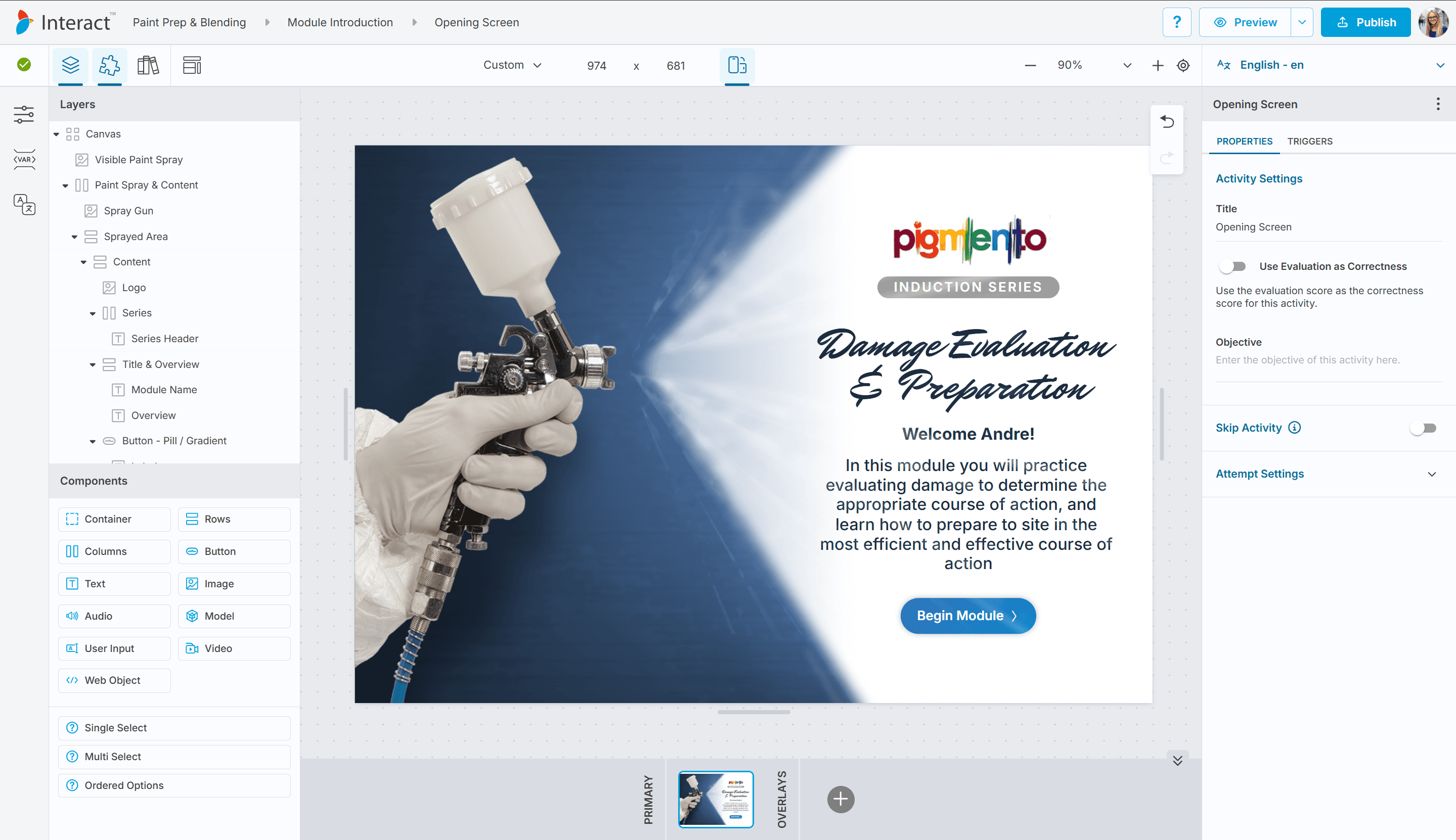
Activity Designer canvas with components, Layers panel open on the left, Properties Panel on the right
Understanding the Activity Designer
The Canvas
The canvas is a resizable, zoomable workspace. It represents the screen a learner will see. You place components directly on it, resize them by dragging their handles, and move them by dragging them to a new position.
The canvas has a fixed size that you control. You can change its width and height at any time using the dimension fields in the view bar, or by dragging the handles on the canvas edges. The canvas floats inside a larger workspace area, so you have room to pan around and work comfortably regardless of size.
Everything on the canvas is real content. The layout you see while designing is the layout the learner sees.
Components and the Design Hierarchy
Components are placed directly onto the canvas or inside a Container component. Containers let you group and lay out other components using a flexbox model. You can nest containers inside containers to build up complex layouts.
The full hierarchy of every component on the canvas is reflected in the Layers panel. The two views (the canvas and the Layers panel) stay in sync at all times.
Layout Mode
Layout Mode is a design aid that highlights container boundaries and layout structure across the canvas. Toggle it on when you want to see how your containers are positioned and nested relative to each other. Toggle it off to return to the clean content view.
The Activity Designer Interface
The Left Sidebar
The left sidebar houses three panels. Only one is visible at a time. Toggle each from the view bar.
Panel | Toggle label | What it contains |
|---|---|---|
Layers | Layers | A hierarchical list of all components on the canvas, reflecting the stacking order. |
Components | Components | A palette of available component types you can drag onto the canvas. |
Library | Insert from Library | A searchable collection of saved templates organised by category. |
The sidebar width is adjustable by dragging its right edge. You can also hide all panels at once with Ctrl+\.
The Layers Panel
The Layers panel lists every component on the canvas in the order they are stacked, from front to back. Components higher in the list sit in front of components lower in the list.
Each item in the list shows the component's name and type. On hover, two additional controls appear:
Control | What it does |
|---|---|
Eye icon | Toggle the component's visibility. Hidden components do not appear on the canvas while designing. |
Lock icon | Toggle the component's lock state. Locked components cannot be selected or moved on the canvas. |
You can drag items in the Layers panel to reorder them or move them into a different container.
Note: Hiding a component in the Layers panel affects your design view only. To control whether a component is visible to learners at runtime, use the Triggers tab in the Properties Panel.
The Components Panel
The Components panel is a palette of component types you can add to the canvas. Components are grouped into two sets: layout and content components at the top, and any question or interactive components available in the current context below.
Drag any component from the panel and drop it onto the canvas to add it.
The Library Panel
The Library panel is a searchable template gallery. Templates are saved layouts and component groups that can be dropped onto the canvas in one step.
The panel has four tabs:
Tab | Contents |
|---|---|
Activities | Full activity templates |
Blocks | Section-level layouts |
Widgets | Reusable component groups |
Media | Media-focused templates |
Use the search field at the top to filter templates by name. Drag a template from the panel onto the canvas to insert it.
Note: The Library panel replaces the Layers and Components panels while it is open. Switching back to Layers or Components automatically closes the Library panel.
The View Bar
The view bar runs along the top of the screen and contains controls for panels, display options, canvas size, and zoom.
Panel toggles (left group):
Control | What it does |
|---|---|
Layers | Show or hide the Layers panel |
Components | Show or hide the Components panel |
Insert from Library | Open or close the Library panel |
Layout Mode | Toggle layout composition overlay |
Canvas size controls (centre):
Control | What it does |
|---|---|
Device preset | Select from a predefined device size (Custom, iPad, iPad Pro, iPhone etc) |
Width / Height | Enter an exact canvas size in pixels |
Rotate | Swap the width and height values to rotate the canvas orientation |
Zoom controls (right group):
Control | What it does |
|---|---|
Zoom Out | Step down to the next zoom level |
Zoom dropdown | Select a zoom level (25% to 500%) or see the current zoom |
Zoom In | Step up to the next zoom level |
Reset | Snap the canvas back to its default position and zoom to fit |
The Action Bar
The Action Bar is a small floating toolbar in the top-left corner of the canvas area. It contains Undo and Redo buttons.
Action | Shortcut |
|---|---|
Undo | Ctrl+Z (Cmd+Z on Mac) |
Redo | Ctrl+Y or Ctrl+Shift+Z (Cmd+Shift+Z on Mac) |
Navigating the Canvas
Panning
Move across the canvas workspace in three ways:
Middle mouse button drag: hold the middle mouse button and drag to pan in any direction.
Scroll wheel: scroll vertically to move up and down; hold Shift and scroll to move left and right.
Canvas drag: click and drag on the background area outside the canvas to pan.
Keyboard: hold Ctrl and press the Arrow keys to nudge the canvas position.
Zooming
The canvas supports smooth zoom to point: when you zoom with the scroll wheel, the canvas zooms toward the position of your cursor, keeping the content under your cursor in place.
Action | How to do it |
|---|---|
Zoom in/out | Ctrl+Scroll (or Cmd+Scroll on Mac) |
Zoom in (step) | Click Zoom In in the view bar |
Zoom out (step) | Click Zoom Out in the view bar |
Select zoom level | Choose a percentage from the zoom dropdown |
Reset to fit | Click Reset in the view bar |
Zoom steps run from 25% to 500% (25%, 50%, 75%, 100%, 125%, 150%, 175%, 200%, 250%, 300%, 400%, 500%).
Working with Components
Adding a Component from the Panel
Open the Components panel from the view bar.
Drag the component type you want from the panel onto the canvas.
Drop it at the position you want. A drop indicator shows where the component will land.
Tip
Drop a component directly onto a Container to place it inside that Container.
Adding a Component from the Library
Open the Library panel from the view bar using the Insert from Library button.
Browse or search for the template you want.
Drag the template onto the canvas to insert it.
Selecting a Component
Click any component on the canvas to select it. A solid border appears around the selected component and the Properties Panel on the right updates to show its settings.
To select a component that is behind another component, click its name in the Layers panel.
Moving a Component
Click and drag a selected component to move it to a new position on the canvas. Release to drop it.
Resizing a Component
When a component is selected, eight resize handles appear on its edges and corners. Drag any handle to change the component's dimensions.
Nudging a Component
With a component selected, use the arrow keys to move it by small increments:
Keys | Movement |
|---|---|
Arrow keys | Move 1 pixel |
Shift + Arrow keys | Move 10 pixels |
Note: Nudging works on absolutely positioned components. Components in a flex layout move according to layout rules rather than direct position.
Snapping
When you drag a component near the edge of another component or near the edge of its parent container, snap guides appear as lines on the canvas showing alignment positions. Release the drag at a snap position to align the component exactly.
Locking and Unlocking a Component
A locked component cannot be moved or selected on the canvas, which protects it from accidental edits.
In the Layers panel, hover over the component and click the lock icon. Click the icon again to unlock.
Hiding and Showing a Component
Hiding a component removes it from view in the canvas without deleting it. This is useful when you want to focus on other components without the hidden one getting in the way.
In the Layers panel, hover over the component and click the eye icon. Click the icon again to make it visible again.
Changing Stacking Order
Components that overlap are stacked in the order shown in the Layers panel. To change which component appears in front:
In the Layers panel, drag the component up in the list to bring it forward, or down to send it behind.
Copying and Pasting
Action | Shortcut |
|---|---|
Copy | Ctrl+C (Cmd+C on Mac) |
Cut | Ctrl+X (Cmd+X on Mac) |
Paste | Ctrl+V (Cmd+V on Mac). Pastes inside the currently selected container. |
Paste Replace | Ctrl+Shift+V (Cmd+Shift+V on Mac). Replaces the selected component with the clipboard contents. |
Deleting a Component
Select the component and press Delete or Backspace.
Warning
Deleting a component removes it and all its settings permanently.
Renaming a Component
In the Layers panel, double-click the component's name. Type the new name and press Enter.
Common Tasks
Undoing and Redoing Changes
Undo: Click the Undo button in the Action Bar, or press Ctrl+Z (Cmd+Z on Mac).
Redo: Click the Redo button in the Action Bar, or press Ctrl+Y (Cmd+Y on Mac) or Ctrl+Shift+Z (Cmd+Shift+Z on Mac).
Designing for a Specific Device
Open the device dropdown in the view bar.
Select a preset (iPad, iPhone 15, or another device) to set the canvas to that size. Or select Custom and type the dimensions you need in the width and height fields.
Click Rotate to switch between portrait and landscape orientation.
Hiding All Panels
Press Ctrl+\ to hide the Layers panel, Components panel, and Properties Panel in one step, giving you a full-width view of the canvas. Press Ctrl+\ again to bring them back.
Using Snap Guides for Alignment
Snap guides appear automatically when you drag a component near the edge of another component or container boundary. Drag slowly near an edge to see the guides, then release to snap into alignment.
Saving a Component as a Template
Select the component or container you want to save.
In the toolbar that appears above the selected component, click Save Content as Template.
Give the template a name.
Once saved, the template appears in the Library panel and can be reused in any Activity.
Keyboard Shortcuts
Key | Action |
|---|---|
Ctrl+Z | Undo |
Ctrl+Y | Redo |
Ctrl+Shift+Z | Redo (Mac alternative) |
Ctrl+C | Copy |
Ctrl+X | Cut |
Ctrl+V | Paste |
Ctrl+Shift+V | Paste Replace |
Delete / Backspace | Delete selected component |
Arrow keys | Nudge selected component 1px |
Shift + Arrow keys | Nudge selected component 10px |
Ctrl + Arrow keys | Pan the canvas |
Ctrl + Scroll | Zoom to point |
Ctrl+\ | Hide / Show all panels |